Enzo Mari, Timor, Danese Milano, 1967, courtesy Danese Milano
Sustainable by definition, since it can be reused indefinitely, the perpetual calendar has been the subject of numerous designer interpretations. Table or wall-mounted, based on the essential geometry of spheres and parallelepipeds or on the relationship between movable elements and a central pivot, these calendars mark the passage of the days and months without becoming enmeshed in the fashions of the moment.
Enzo Mari, Formosa, Danese Milano, 1963, courtesy Danese Milano
Hanging a calendar on the wall, or placing it in plain sight on the desk, represents a symbolic gesture that for most people visually marks the transition into the new year. While the most frequently seen versions are disposable calendars, made to be replaced at the end of the twelve months, another type of calendar has also captured the attention of designers since the post-war period: the perpetual calendar, which does not end its useful life on 31 December but can accompany its owner for life.
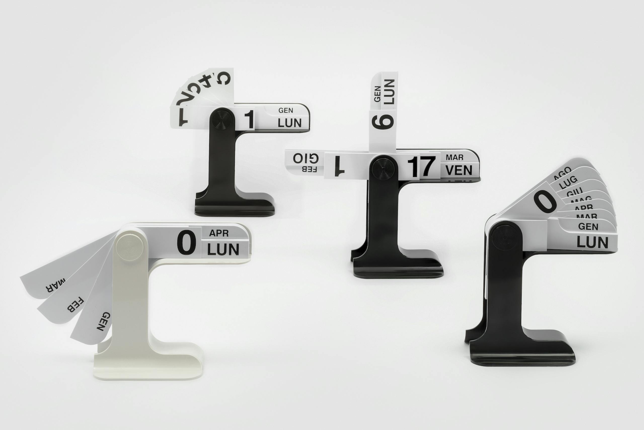
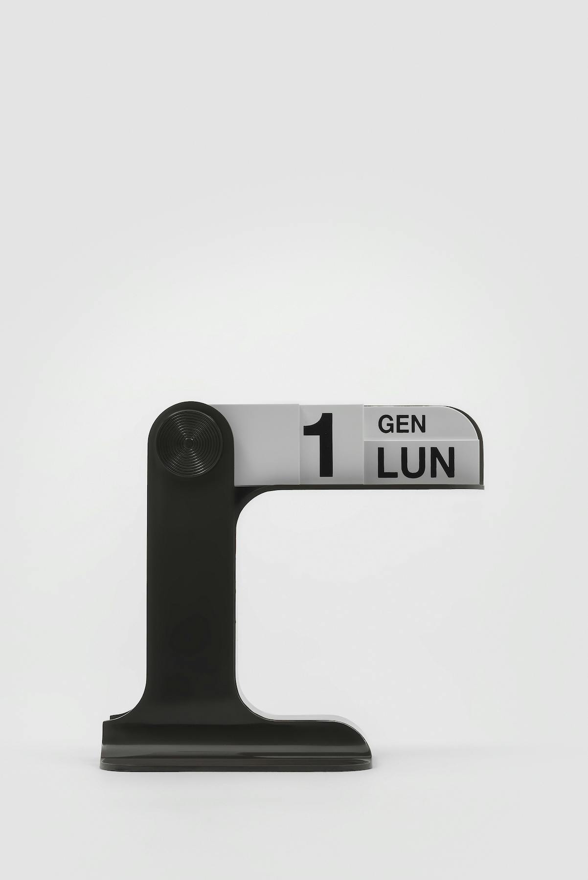
The most famous of these is without a doubt Timor, designed by Enzo Mari and produced by Danese Milano in 1967. With the days and months printed on PVC slats that fan out around a central support and an aesthetic reminiscent of railway signage, it embodies several of the cornerstones of its creator’s work: it has an essential form, is designed to last and is interactive, which is to say it needs the user’s intervention to express its potential, like many of the kinetic and programmed art works created by Mari in those same years. The decision to use plastic makes it an accessible object, consistent with the approach of a designer who was always convinced that industry and design could not “disregard the word égalité, equality” and that the essence of his work lay in “designing something ‘beautiful and good’ for everyone, comprehensible and appreciable by all, rather than making something that remains the allotted portion of a small elite” (Enzo Mari, 25 modi per piantare un chiodo: sessant’anni di idee e progetti per difendere un sogno, Mondadori, 2011).
Enzo Mari, Timor, Danese Milano, 1967, courtesy Danese Milano
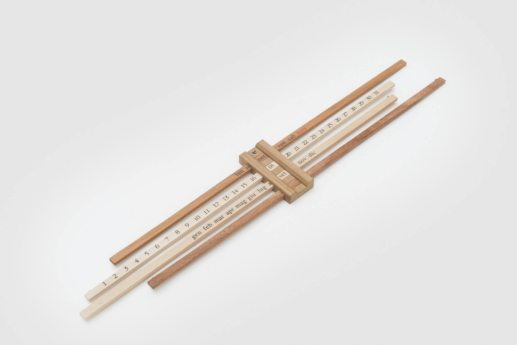
Timor is not Mari’s first perpetual calendar: in the time before his long association with Bruno Danese and his company he had already designed Bilancia (1959), inspired by the scales (‘bilancia’) of yesteryear and consisting of a central wooden frame through which rods of different woods can slide, highlighting the silk-screen-printed days and months, and Formosa (1963), with an anodized aluminum base supporting a series of movable PVC slats. What the two calendars designed in the 1960s have in common, apart from the fact that they bear the names of islands carefully chosen from an atlas, is the use of one of the world’s best-loved typefaces: Helvetica, designed in Switzerland and much loved by the designer for its clarity and so often used by him in his graphic production.
Enzo Mari, Bilancia, Danese Milano, 1959, courtesy Danese Milano
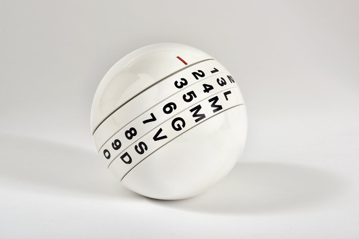
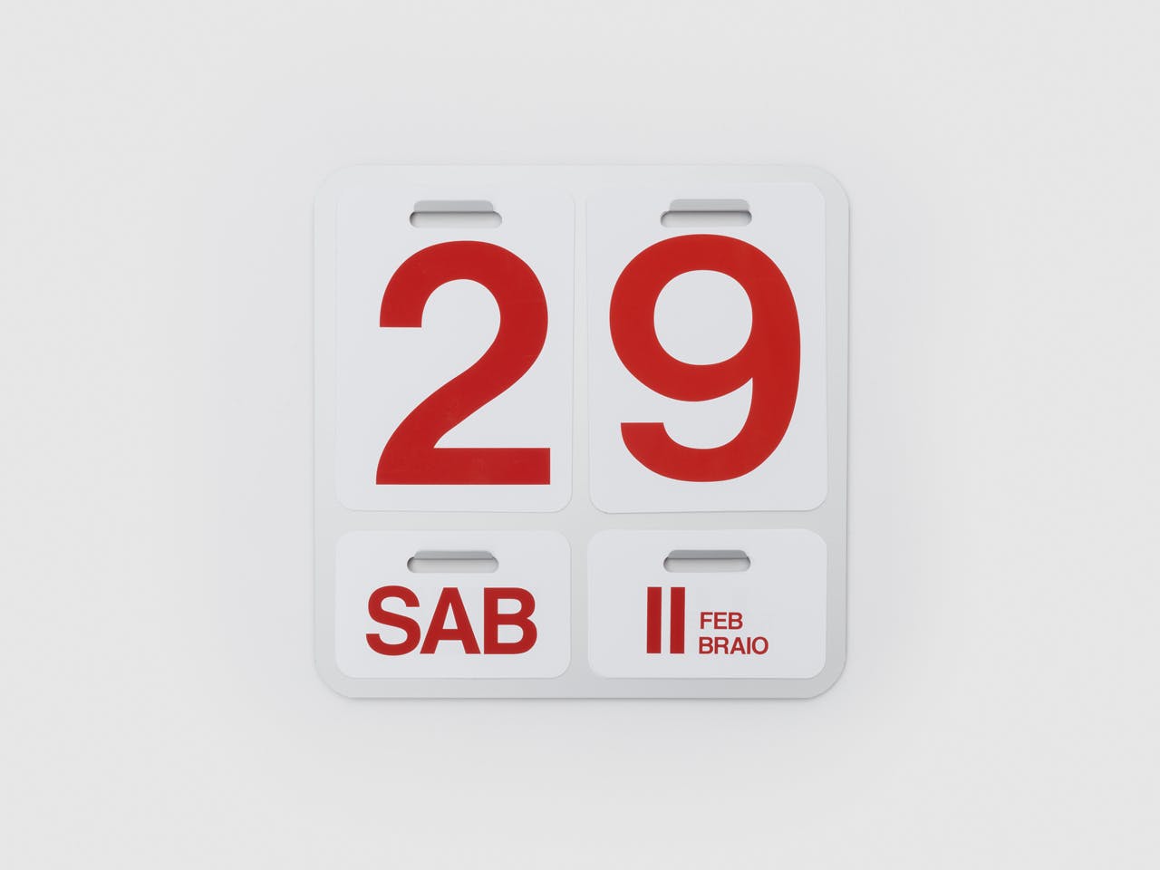
Another great graphic designer, Pino Tovaglia, a daring experimenter capable of transfiguring prosaic elements from everyday life into what effectively became visual poems, is the “father” of two very famous perpetual calendars. In 1970, when he created Giotto for the historic lighting company Valenti, he had already designed book and magazine covers, posters, a typeface (Forma, in 1968) and a series of memorable advertising campaigns (for Lanerossi, Alitalia and Pirelli, among others). Available in two versions, white and black, Giotto comprises a hard plastic sphere whose central sections rotate, allowing digits and letters to be aligned to form the date. Five years later, in 1975, he produced Calendone, designed for Nava Design and decidedly essential in appearance: the large black numbers on a white background that make the wall calendar so recognizable are also the only information its provides, but it can then be reused year after year.
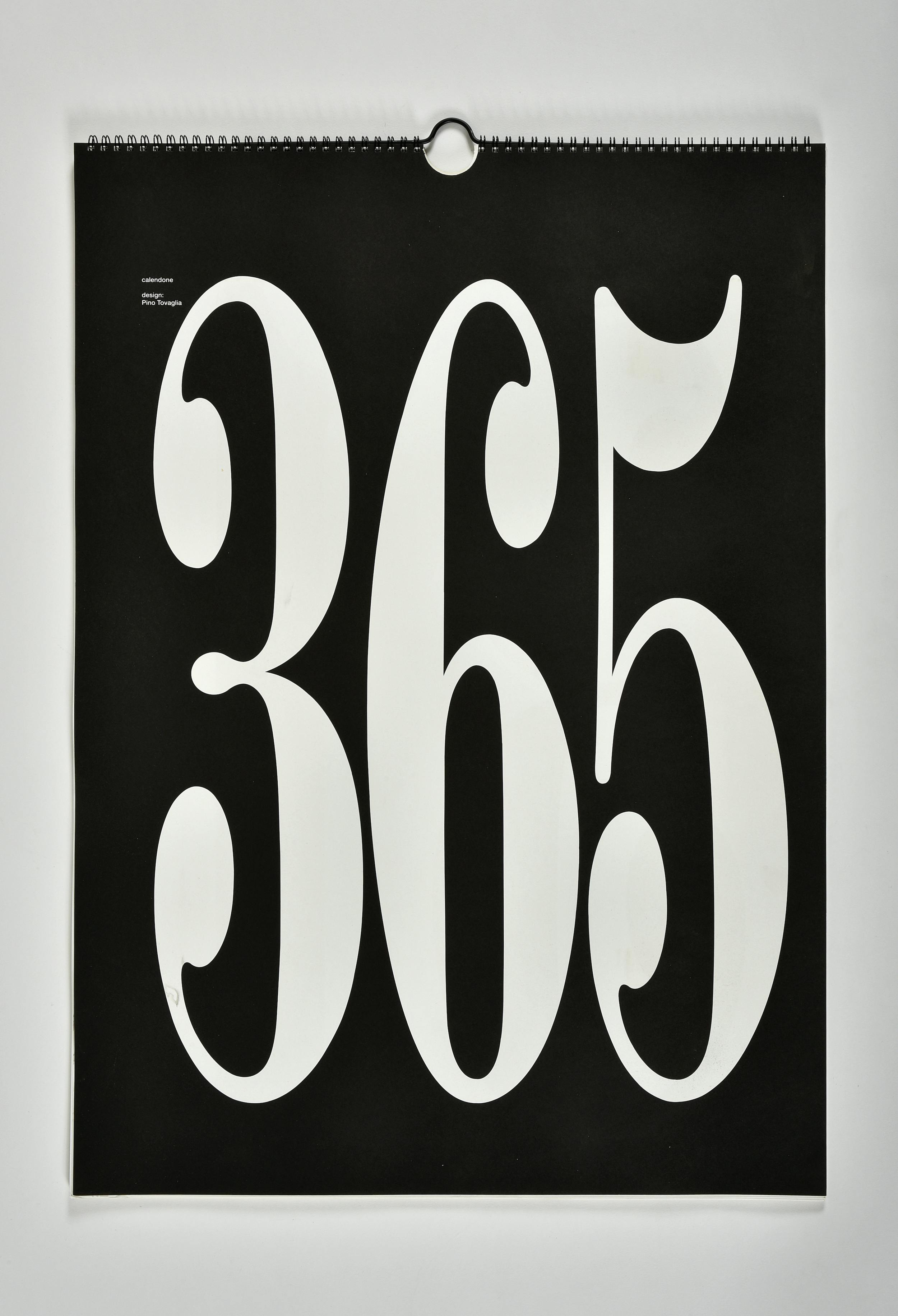
Pino Tovaglia, Nava Design, Calendone, 1975, photo Federico Manusardi
The contemporary reinterpretation of the object marking the passage of days and months has in much more recent times also been the subject of interest of the Japanese studio Nendo. Oki Sato and his collaborators, who like to reason about the passage of time starting with simple, everyday objects, designed a perpetual calendar with minimalist lines in 2017, which was then produced by I.D.E.A. International. Key Calendar, as it was called, is a parallelepiped with many locks that correspond to days of the week and months and which comes with three keys to be inserted to compose the correct date.
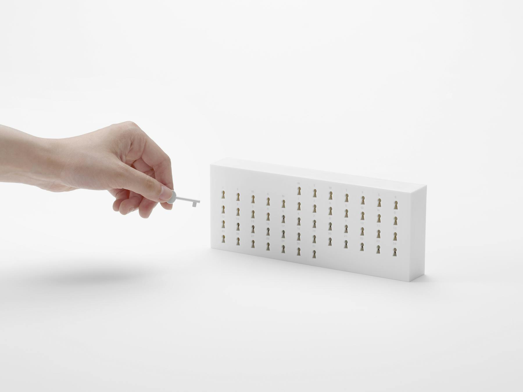
Nendo, Key Calendar, I.D.E.A. International, 2017, photo Hiroshi Iwasaki
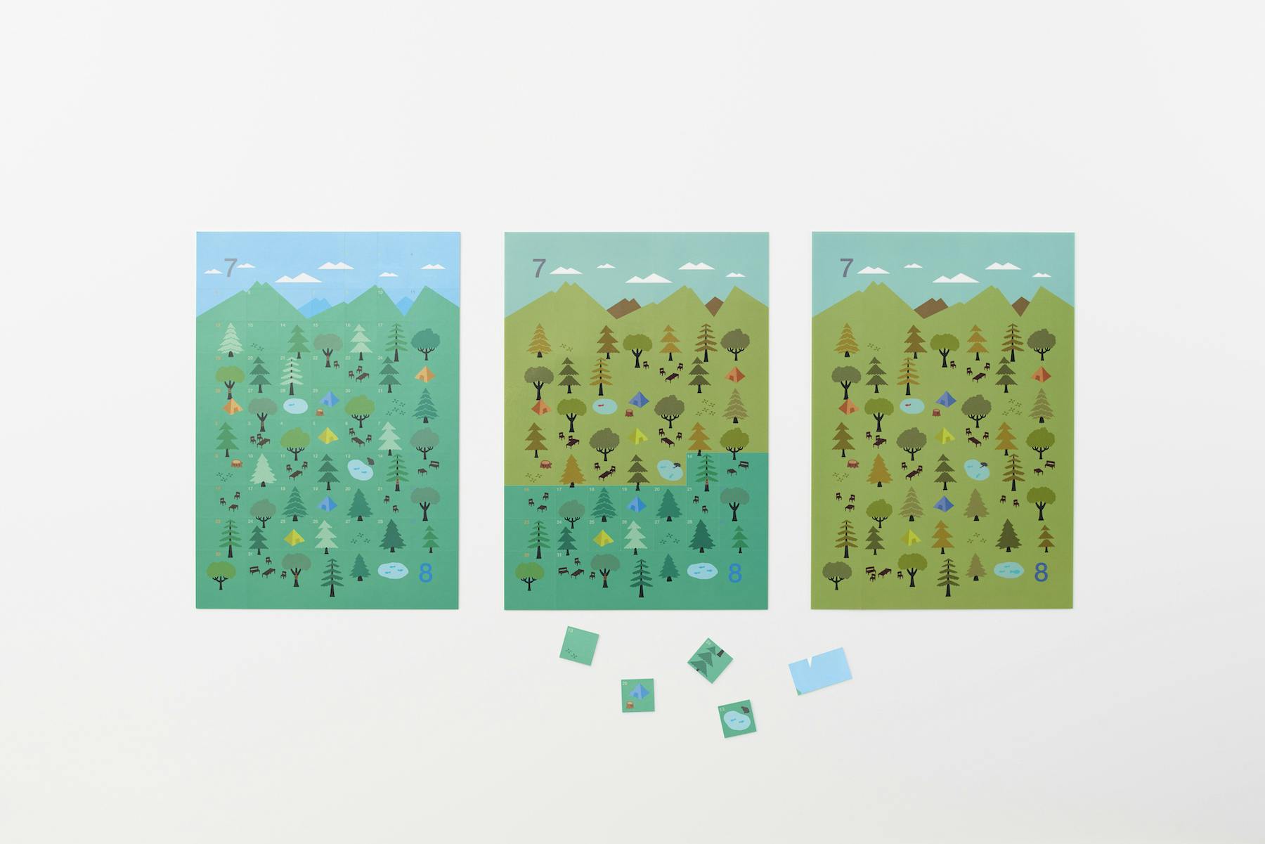
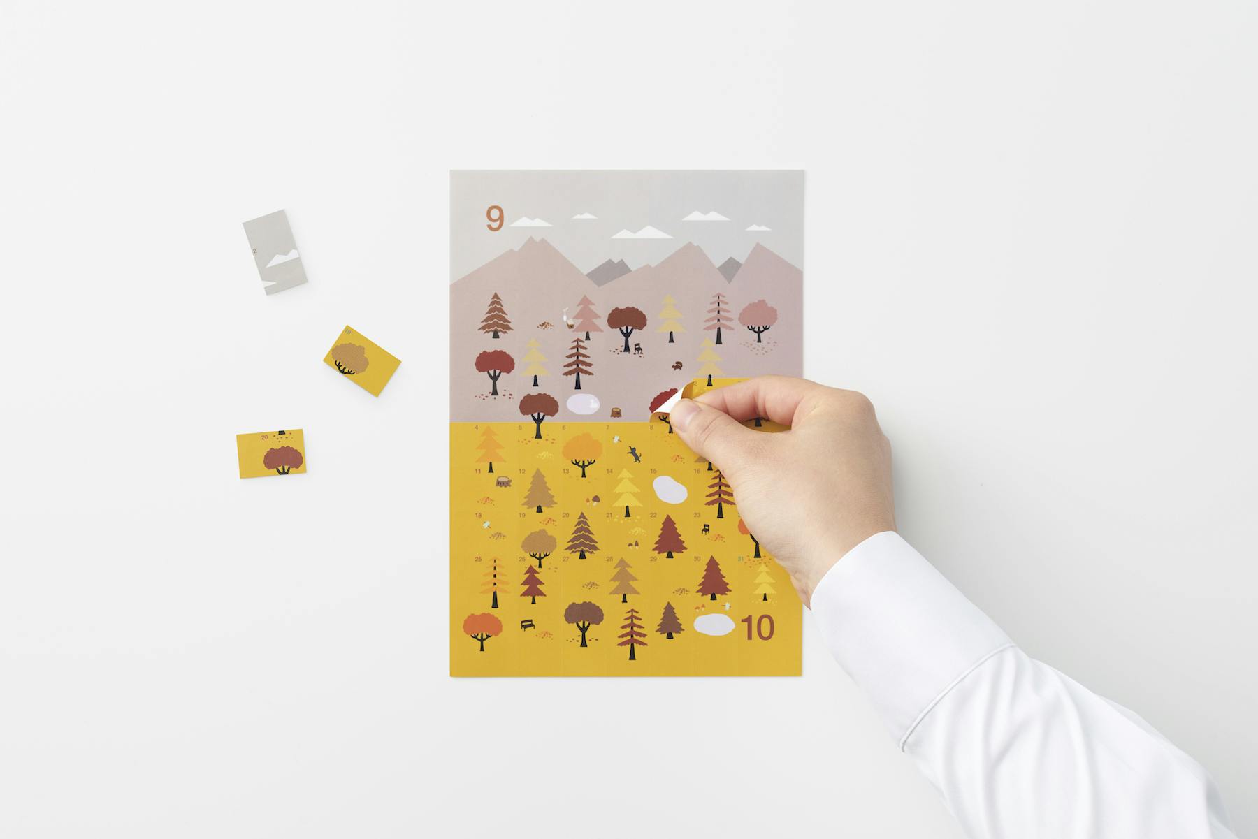
While in this project everything revolves around duration, as well as around the metaphorical wish to “open a new door” every morning, the Sticker Calendar designed two years earlier and marketed in Japan and France under the brand name by | n embraced the concept of impermanence, which becomes the central element of a reflection on nature. This calendar is made of sticky boxes to be peeled off day by day, discovering new portions of a landscape that is constantly changing in line with the succession of the seasons, represented through a color code: white for winter, blue for spring, green for summer, and yellow and brown for autumn. The snow cover of January gradually gives way to the spring vegetation and rain in May, and then transforms into the bright colors of July and August and the burnt hues of autumn’s dry leaves, waiting for the snow to come back and cover everything.
Nendo, Sticker Calendar, by | n, 2015, photo Akihiro Yoshida