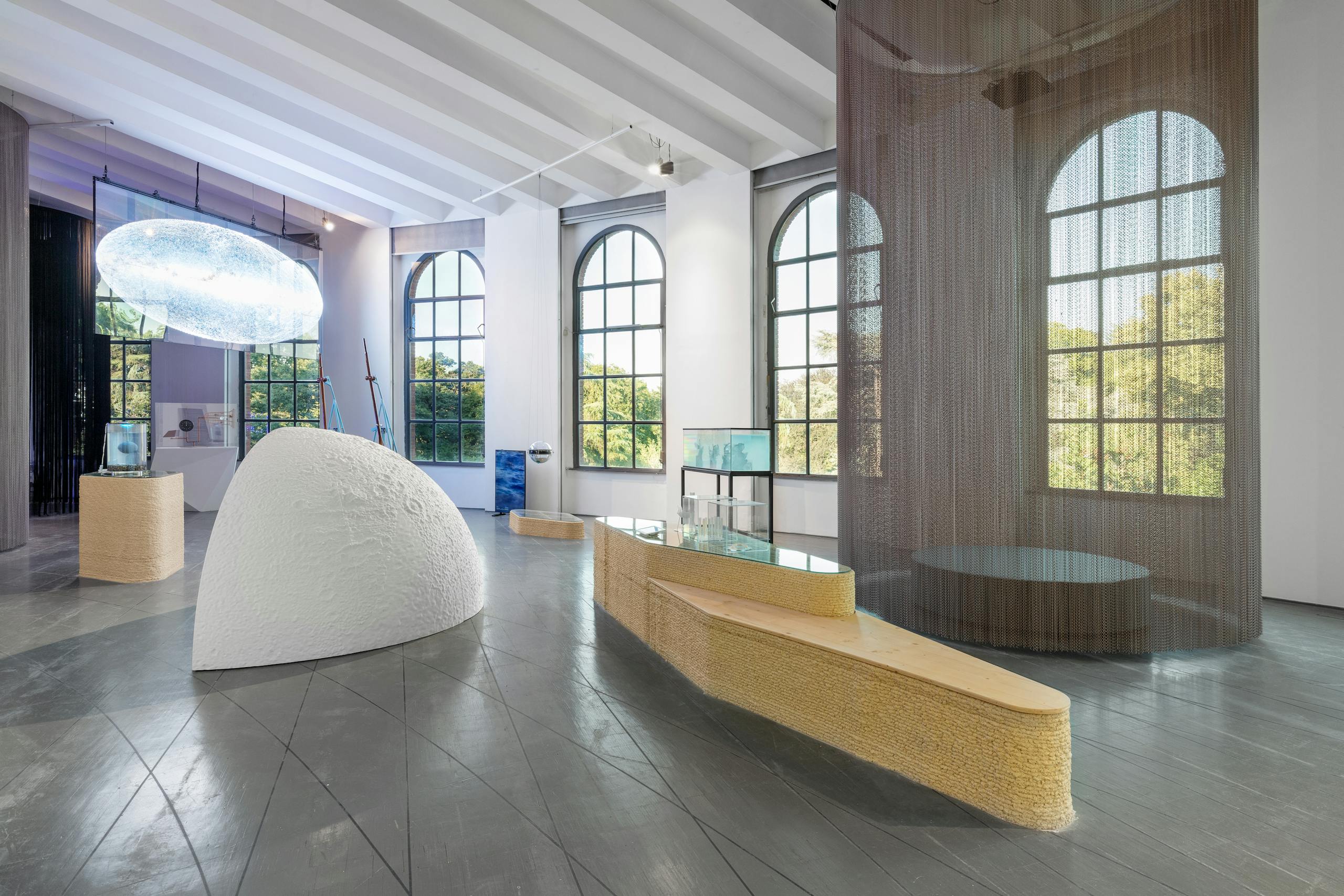
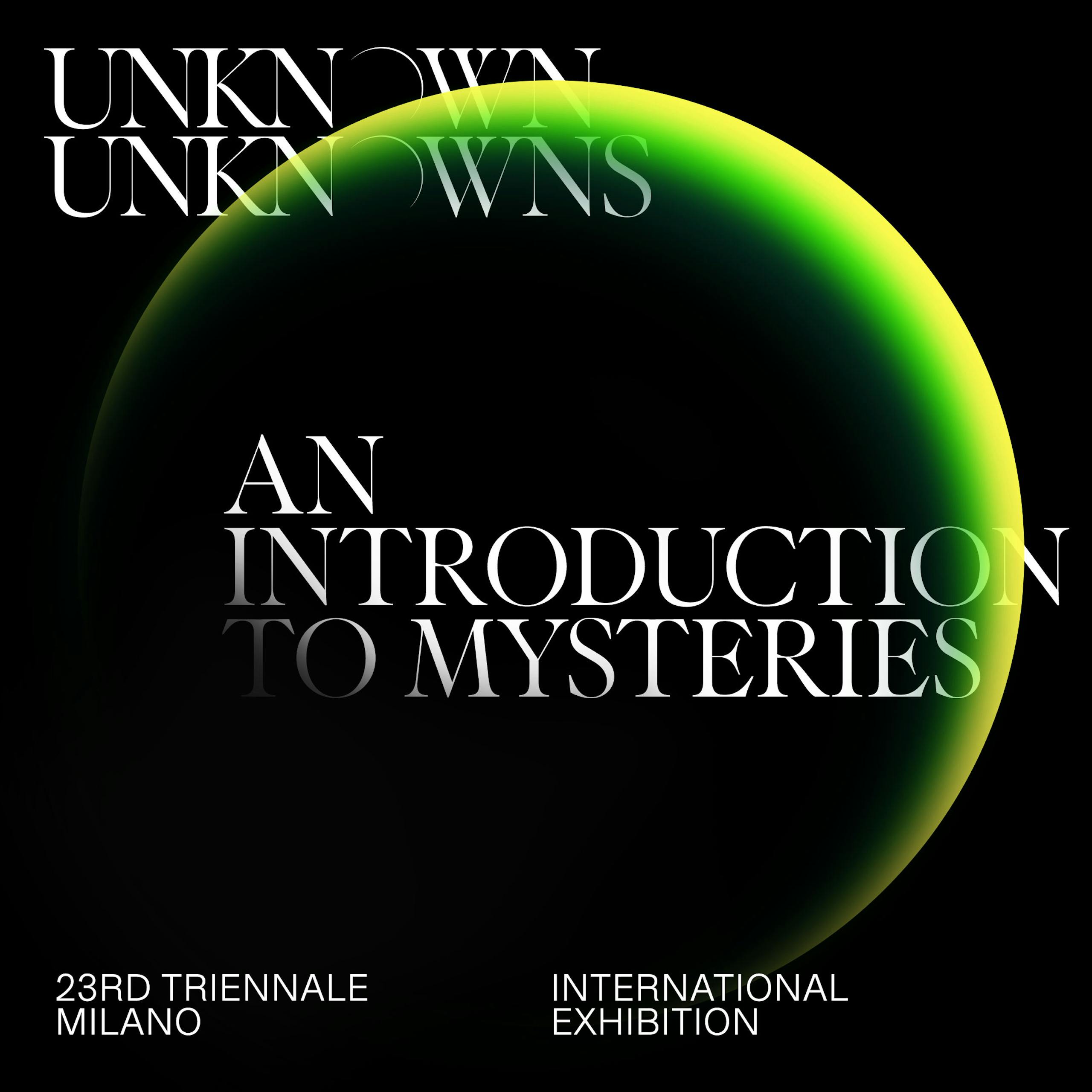
Visual identity of 2x4 for the 23rd International Exhibition
The New York studio 2x4 talks about the visual identity project for the 2022 International Exposition
In October 2020 we launched a selection process, inviting five graphic-design studios of international renown and asking them to submit a proposal for the visual identity of the 23rd International Exhibition. The selection was made by a committee consisting of Stefano Boeri, the president of Triennale Milano, Ersilia Vaudo, the curator of the 23rd International Exhibition, and some members of the advisory board. The development of the proposals was to be carried out in two stages and the 2x4 consultancy was chosen for the task.
Visual identity of 2x4 for the 23rd International Exhibition
2x4 is a global design consultancy with studios in New York City and Beijing founded by Michael Rock, Susan Sellers, and Georgianna Stout in 1994. We focus on brand strategy and design systems for art, culture, fashion, technology, architecture, and urbanism. Our intellectual and creative conviction is that thoughtful design can make an essential contribution to every level of cultural discourse.
The consultancy’s main partnerships in the cultural sector include those with the Lincoln Center in New York, the Guggenheim in Las Vegas (together with OMA/Rem Koolhaas), the Cooper Hewitt, Fondazione Prada, and The World Around platform for architecture.The 2x4 design team working on the 23rd International Exhibition consists of Michael Rock, Executive Creative Director; Margot Weller, Director of Strategy; Donnie Luu, Director of Branding; Marcus Hollands, Senior Designer, Branding; Ben Fuhrman-Lee, Senior Designer, Branding; Brynn Komro: Associate Director, Project Management.
Visual identity of 2x4 for the 23rd International Exhibition
Was the theme of the 23rd International Exhibition a challenge for you? How did you tackle it?
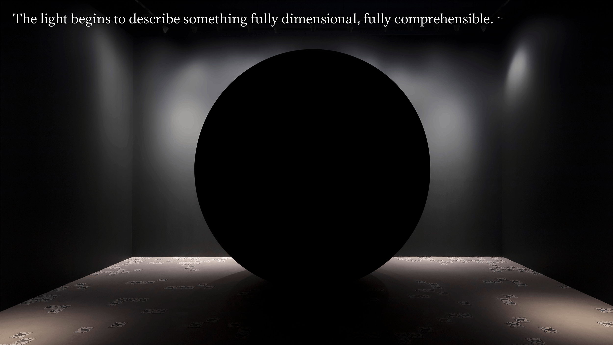
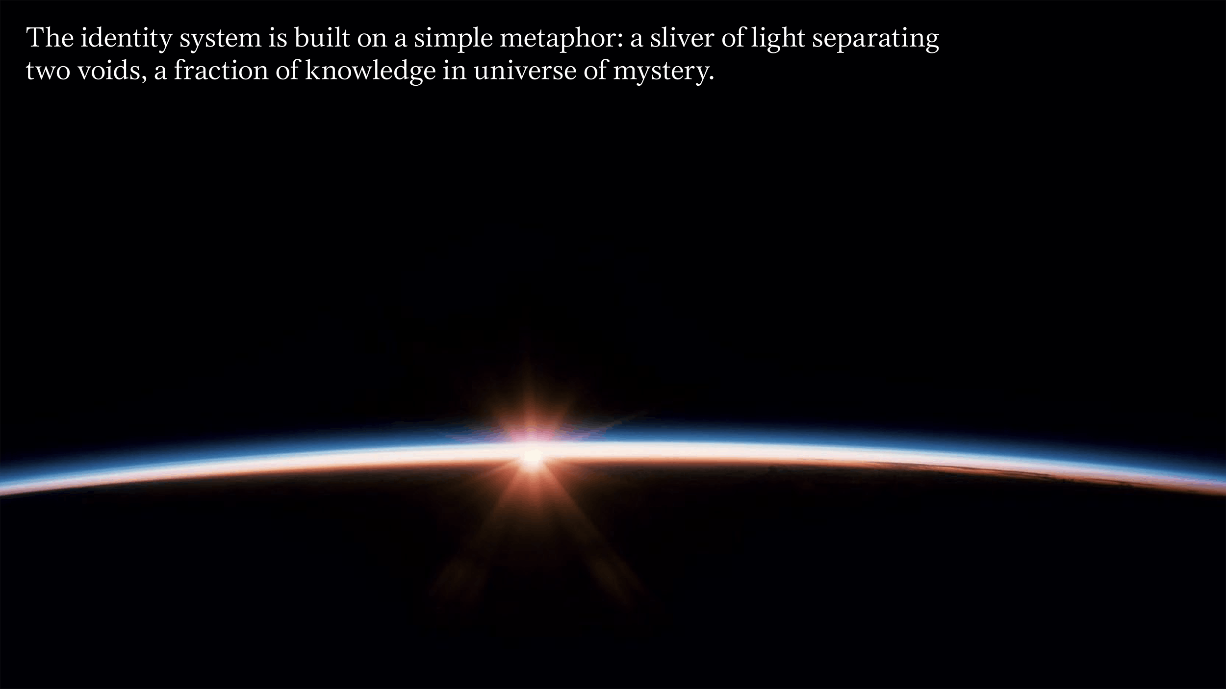
Yes, it was a challenge because it was a design about void space. We started with Stefano Boerito’s charge to "construct a series of questions that help us understand which areas of human knowledge are still indecipherable, starting from our relationship with the sphere of the natural phenomena.” Because we are dealing with visual material, we concentrated on knowledge through vision: what could, and could not, be seen and comprehended. Originally we focused on obscuring: blocking what should or could be seen. As the design evolved we shifted to the idea of the lacuna, the missing part. Leaving gaps invites the viewer to fill in the blank. Then we layered in the idea of the sliver, the small edge of illumination that starts to render a full form.
Visual identity of 2x4 for the 23rd International Exhibition
Is the method you used to develop the graphic design pitch and subsequent visual identity for Unknown Unknowns a standard practice or does it vary according to the specific brief?
We have a very defined process we apply to every project that is based on asking and answering very simple questions: What is this? Why does it exist? etc. This leads us to a deep research period where we immerse ourselves in the material, content, and references the brief describes. But once we establish an intellectual platform to work from we try to be as open, intuitive, and visual as possible which can take us in any direction. So while the foundation is based in our studio practice, the design part is the result of the collective work on a team of collaborators.
Can you summarize the main design choices you made? Typography seems to be a key factor in the identity, using elements you do not often see nowadays in projects that focus on digital communication (serif typefaces)
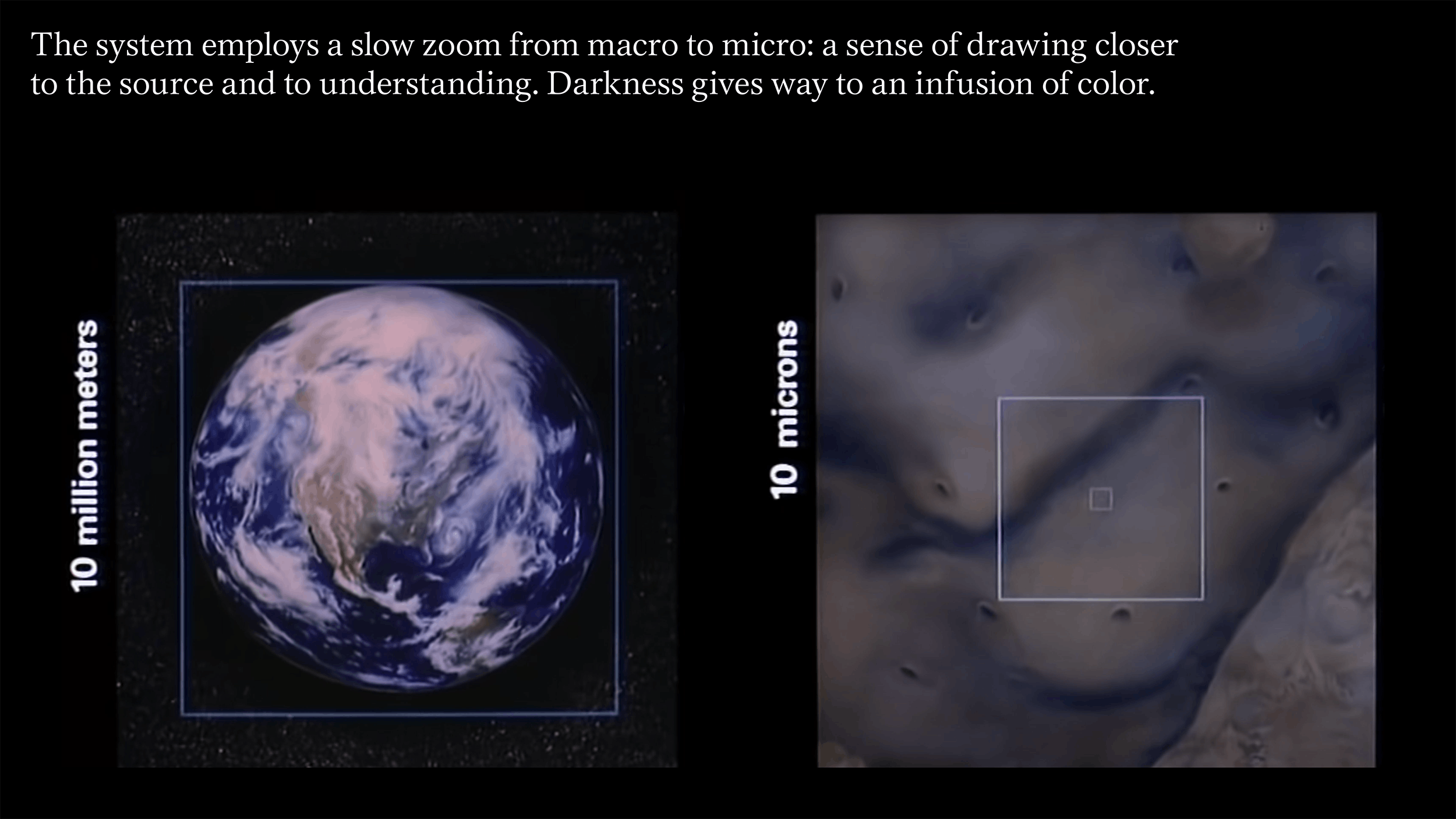
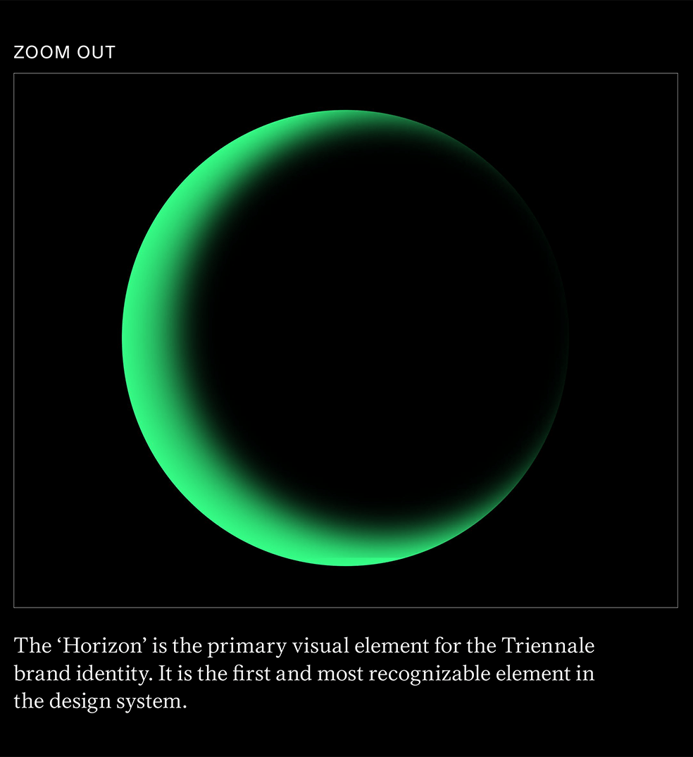
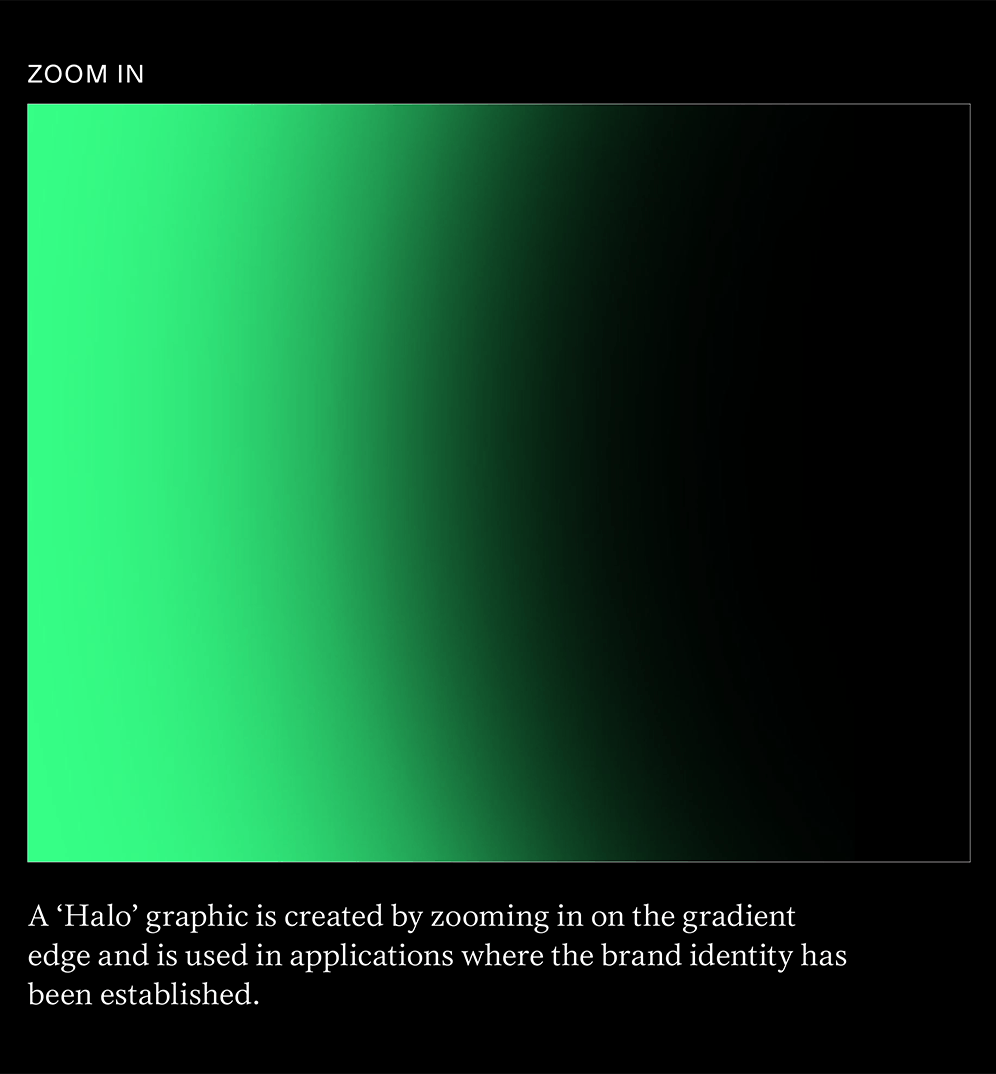
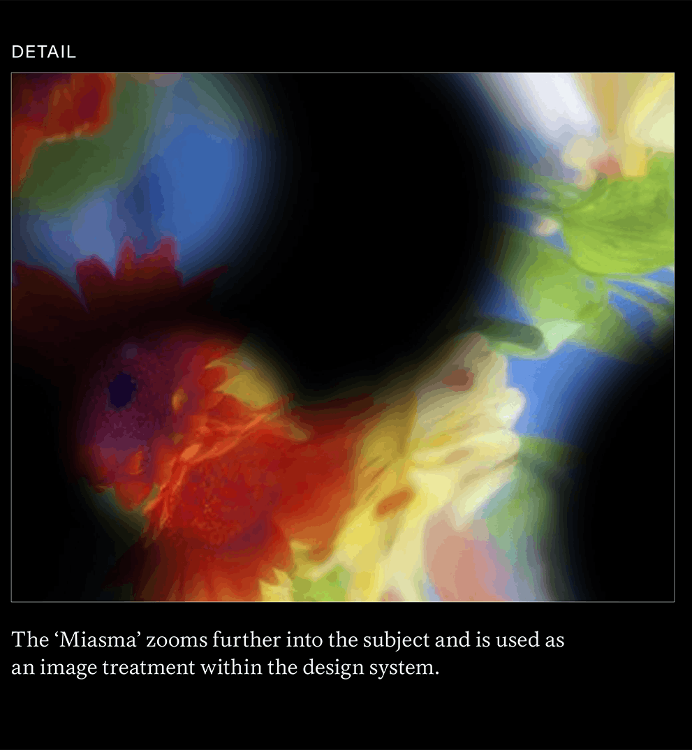
Every project has innumerable choices, each incrementally getting us closer to the final decision. We try to first establish a number of strategies, in this case things like: Be void. Be blurry. Be obvious. Be inscrutable. etc. Then we all try to sketch very widely using the strategies as a starting point. This produces a lot of material that we constantly review and compare cognizant of very practical problems of clarity, readability, visibility, differentiation, etc. So we considered color, form making, typography, art direction, knowing that the system would have to accommodate many different conditions, styles of work, and applications. We chose the very beautiful classic typography specifically to contrast with the abstraction of the imagery. We wanted to reference two forms of attempts at knowing: an intellectual, literary investigation suggested by the serif typography and a more clinical, scientific language of the almost astronomical imagery.
Do you think that graphic design can (or should) always bring along deeper meaning, also confronting social and political issues?
Yes, design is a kind of second text, overwritten on the original content. We think its incumbent on design to add depth and meaning to the content it is charged with conveying.
What is the Unknown you wish to remain unknown and to whom would you like to ask this same question?
Ha. As Thomas Huxley states “The known is finite, the unknown infinite,” so there is always an inexhaustible supply of unknowns. We’re not afraid of running out.
Related events

Related articles
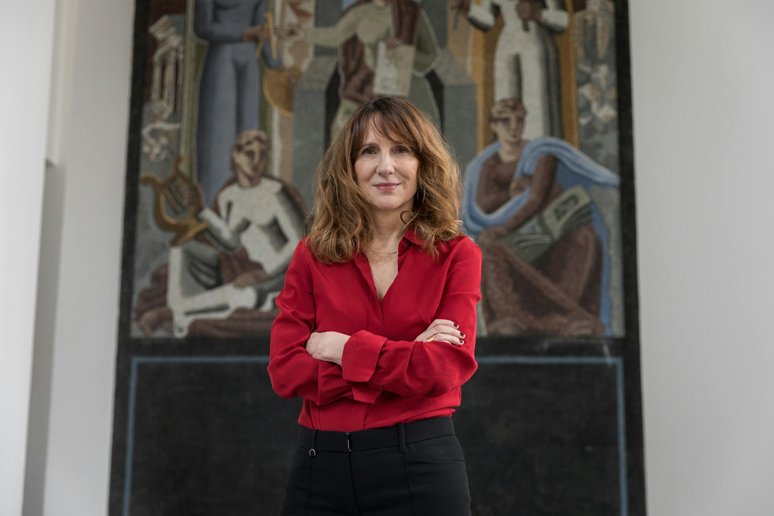
The charm of the Unknown Unknows told by the curator of the 23rd International Exhibition

Dimitra Louana Marlanti talks about mysteries

Mysteries narrated in a video by Giulio Squillacciotti
