
© Juho Länsiharju
I first wrote about Inga Sempé’s work for "T Magazine", where I was the design editor, in 2007. I was fascinated by the French designer’s utter lack of pretense, and her insistence on the importance of function over aesthetics or philosophy. “I never think of an aesthetic idea first,” she said. “I only think of a use,” which was a brutally honest statement compared to the sometimes convoluted rationales that some designers offered for their esoteric designs in that decade.
Courtesy Inga Sempé
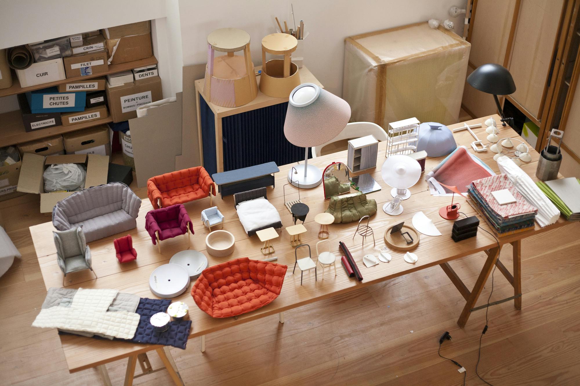
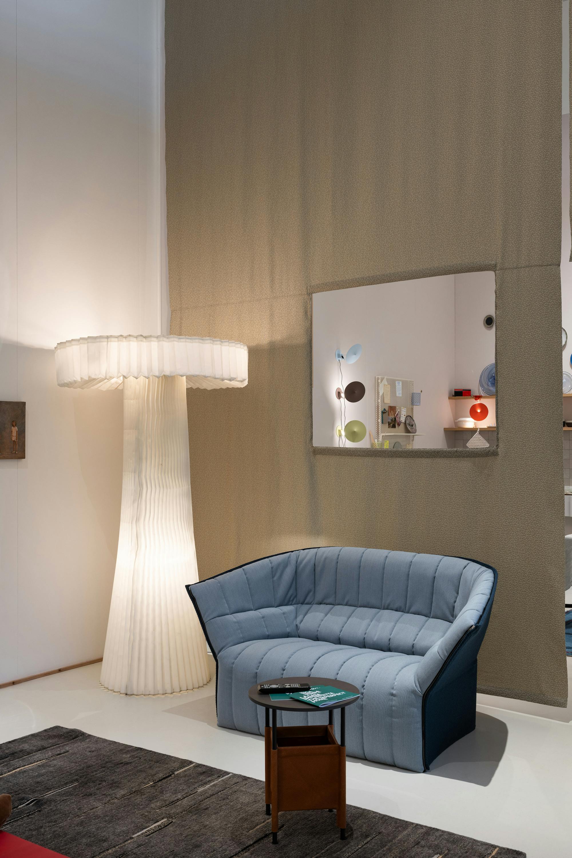
So it is not surprising that Sempé’s project at the Triennale Milano illustrates the designer’s philosophy in an atypically straightforward manner—as a small house, designed in collaboration with Studio A/C, measuring about one hundred and fifty square meters, with walls made of the textiles the designer created for the Danish company Kvadrat, and spaces filled with the furniture and objects that she has designed for various European and Scandinavian manufacturers since the early 2000s.
The entry, she says, opens to the living room, behind which are a bathroom, a small home office, a bedroom and a kitchen. Sempé explains, “I wanted to build a house” for this display “because I don’t like exhibitions where objects and furniture are put on high bases, like those for sculpture, demanding to be looked at as priceless masterpieces. I find that quite boring, and I don’t need to be looked at as if I were an artist; being an industrial designer is enough for me.” About the house Sempé says, “I want it to look lively, as if the owner has just left to go and buy some bread, and has had a stroke, or got hit by a car... the visitors should be like the police visiting the house to find his ID. So there should be crumbs, a couple of remote controls on the sofa, some invoices on the desk, leftovers in the fridge. But the owner does not necessarily need to be dead. He might just have a broken ankle. So we might find some socks.”
Inga Sempé. La casa imperfetta, installation view, foto di Gianluca Di Ioia
Besides Sempé’s humorous mention of socks, the installation offers a comprehensive look at the furniture and objects that she has designed. The ethereal pleated floor lamp designed in 2002 for the Italian company Cappellini, contrasts with the steel Step-ladder chair, a 2007 design for the Parisian company VIA, with a telescopic back that becomes a safety railing turning the chair into a stepladder. A more traditional approach to comfort characterizes the Moël sofa, a 2007 design for the French company Ligne Roset, while for the same manufacturer, the contrast between the linear wood structure and the plush padding of the Ruché collection (2010-2014) offers a more contemporary approach. The small shelves Balcon, Belvédère and Bénitier, 2011 designs for Moustache, offer a more whimsical approach to display, while the cork Torno shelf and bowl, 2011 designs for the Portuguese company Materia, offer a more practical “pick-up and drop-off spot for random objects.” Sempé’s Collo-alto 2015 flatware for Alessi is sleek but shapely, while her Varg set, with its pewter, brass glass, pitcher and a leather tray, takes on a more sculptural approach.
Vitrail, Magis, courtesy of Magis
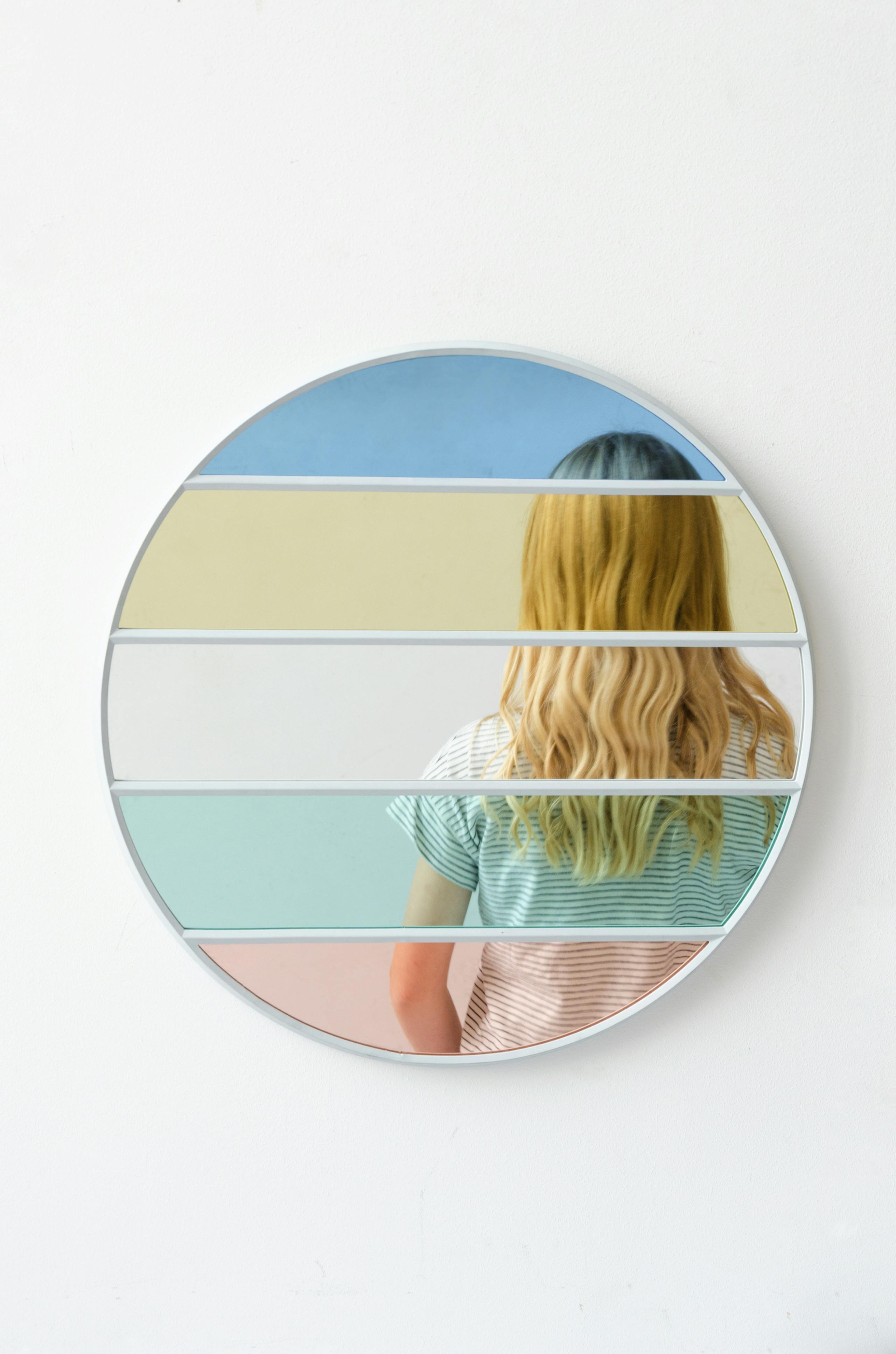
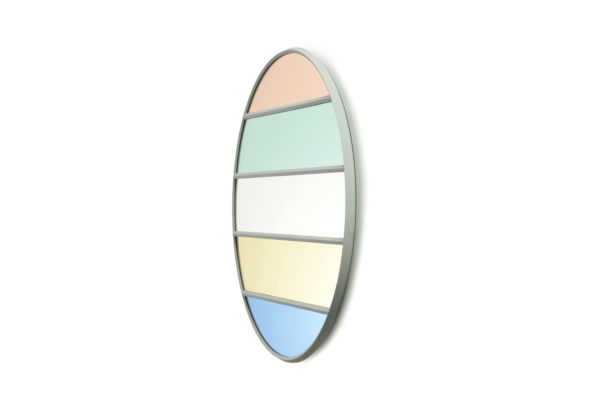
Sempé’s talent for transforming simple materials is evident in her 2018 Vitrail collection of mirrors for the Italian company Magis, where she combines clear and colored glass to tantalizing effect. At the same time, her 2014 Tratti tiles for Mutina adorn small, square tiles with enticing patterns of drawn lines. Sempé also goes against the prevailing trends in her design for the Column kitchen, a 2023 design for the Danish company Reform, with its curved-profile columns that double as handles, and her Mousqueton portable lamp for Hay. While most portable lamps are designed to be as futuristic as possible, Mousqueton, with its flared shade, looks as if it were influenced by older lamp designs.
A design doesn’t have to look down to earth. It has to be down to earth
But objects are not the only things in the house. Artworks by Mette Ivers can be found there, along with work by the artist Saul Steinberg. Focusing on her philosophy of design is still a priority for Inga. The idea of “down to earth” is important to her. A design “doesn’t have to look down to earth,” she says. “It has to be down to earth.” And, she continues, “My target goal in life is to do some objects that are in shops.” This could sound as if coming from a designer with no ambition. Or, in Inga’s case, it could sound like the ambition of a designer who is completely tethered to reality. This philosophy does not preclude designing beautiful things; it simply means that they will come from a place of logic.
Credits
The text Paris – New York di Pilar Viladas is taken from the catalogue Inga Sempé. The Imperfect Home (Electa, 2024), edited by Marco Sammicheli.
Related events
