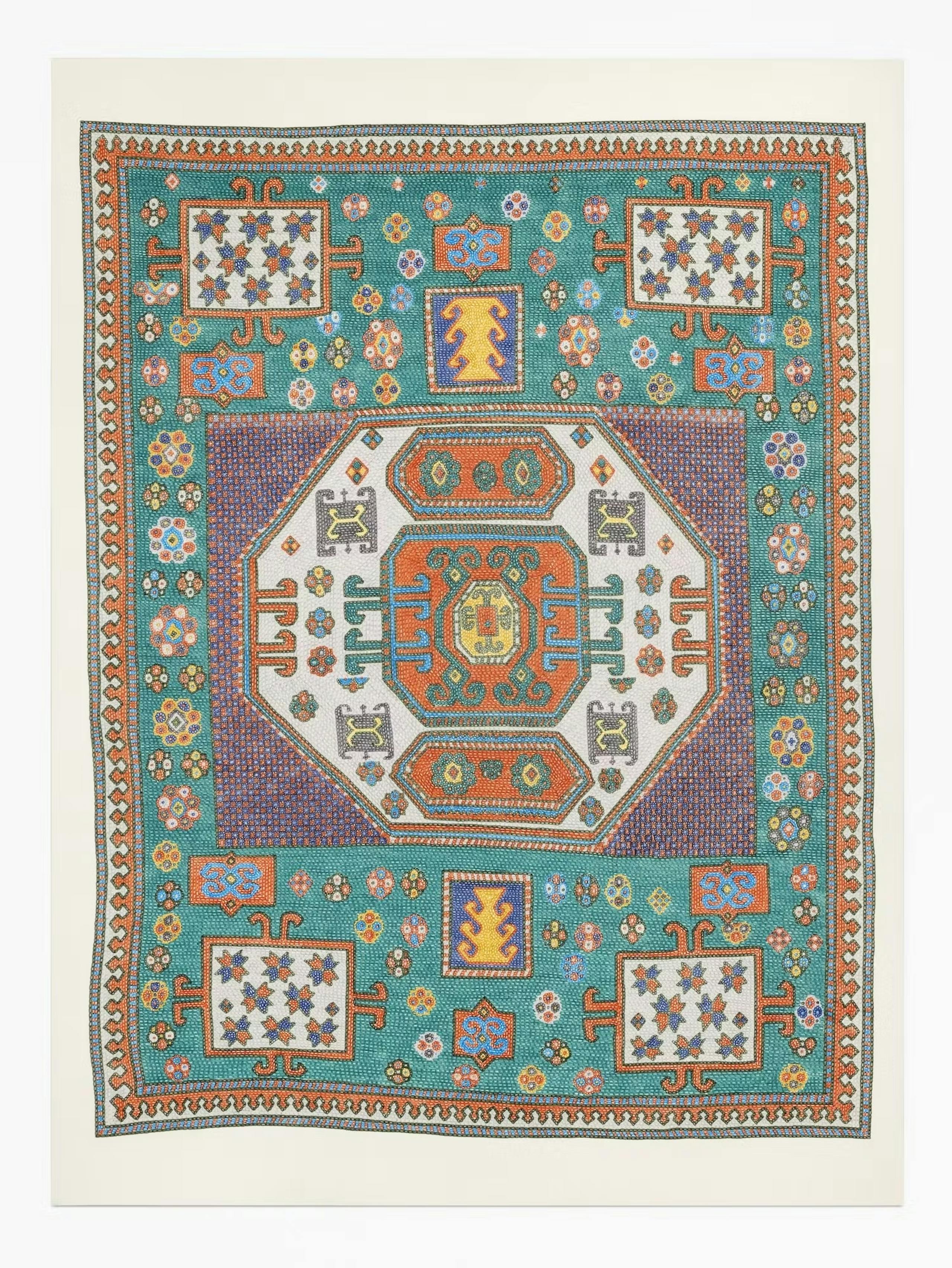
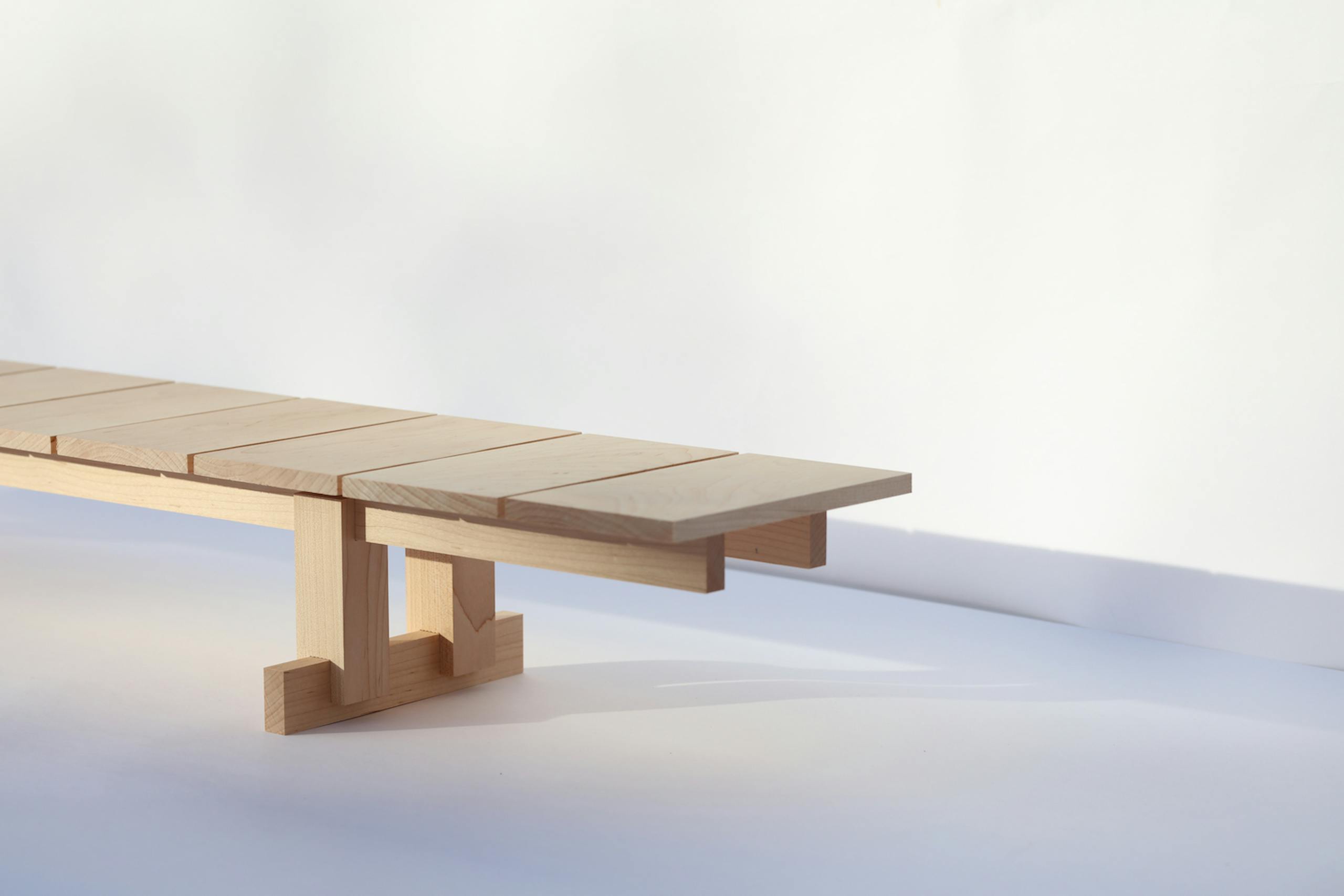
Triennale Table, scale model, photo by Henrik Tjærby
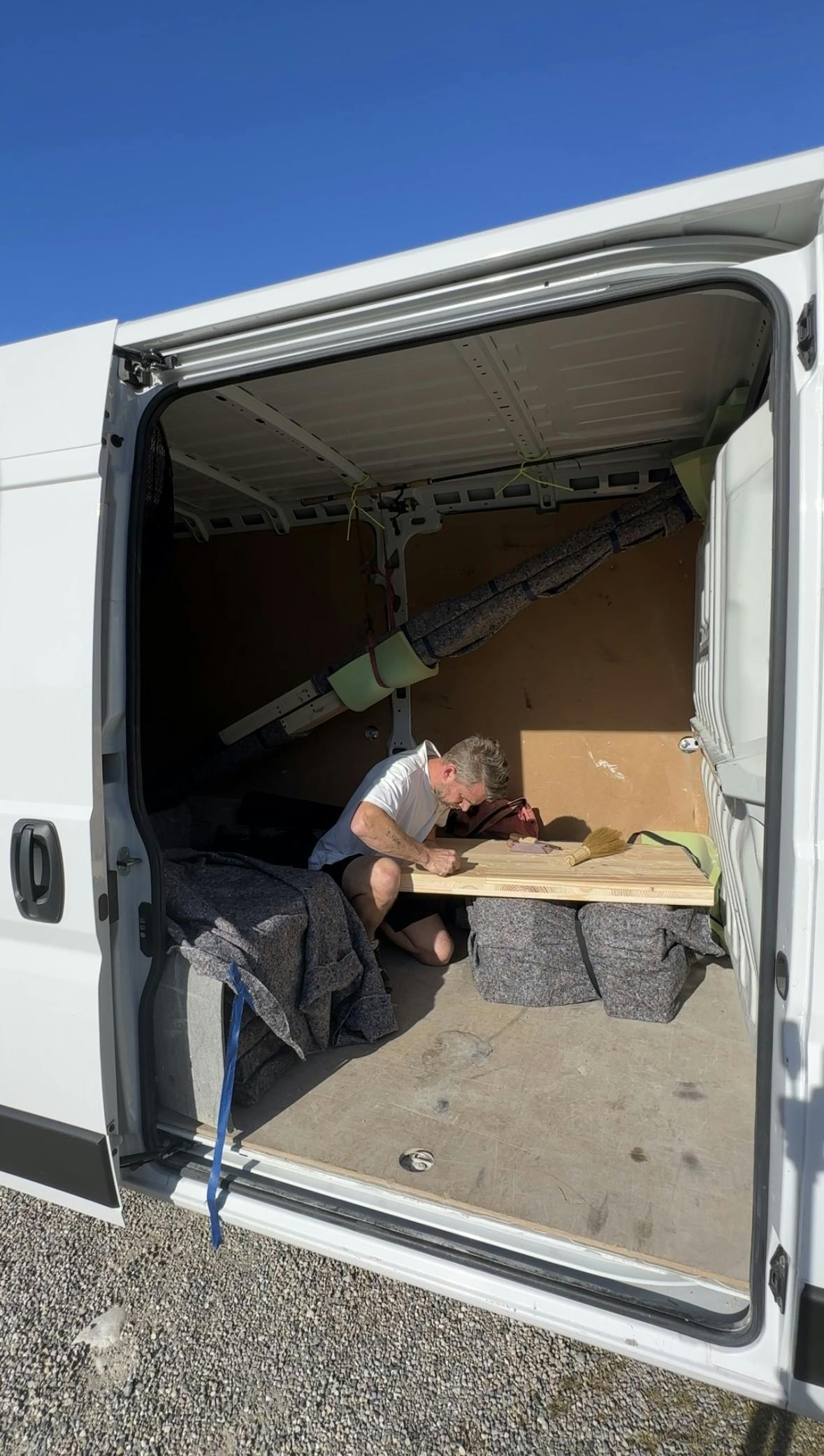
The table in Galician pine created by the Danish designer Henrik Tjærby for the Text exhibition is many things at once: a functional object; an atlas of the possibilities offered by woodworking; an exercise in co-design involving 12 colleagues; a sui generis self-portrait, and a collection of stories. We had him tell us a few in this interview.
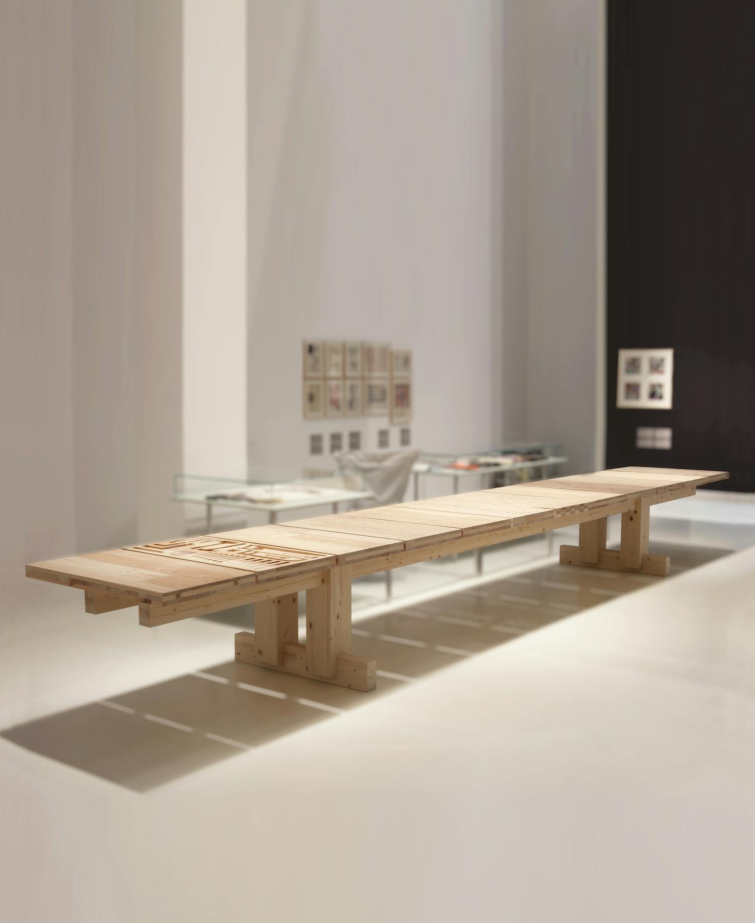
Triennale Table, photo by Henrik Tjærby
Born in Denmark but resident in northern Spain for around 15 years, Henrik Tjærby describes himself as an “industrial designer” and a “maker”, convinced that these two seemingly opposite approaches are complementary. In his workshop, built using recycled granite—taken from fallen down houses in the Galician countryside—he alternates the artisanal manipulation of wood—a material he loves and has had the chance to explore while working with firms like Artek and Vaarnii famous for their unique know-how—with the use of state-of-the-art digital machinery. It was only natural, therefore, that when Marco Sammicheli commissioned him to create a special piece for Text, he proposed a functional object: a 7-meter long pine wood table, which is also a compendium of the different manual and low- and hi-tech woodworking techniques, as well as a tribute to his friends from the design industry who shaped him as the designer he is today.
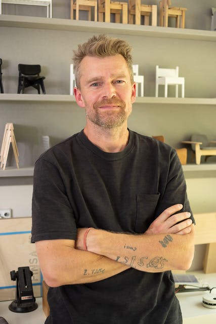
Henrik Tjærby, photo by Simone Maestra
The exhibition hinges on the relationship between text and texture: two words that have the same etymology (deriving from the Latin texere, “to weave, to plait”). In fact, writing and weaving are based on the same principle: constructing something more complex from a series of elementary units—words, stitches or knots—connected according to a number of syntactic rules. In both activities creativity can be expressed freely, but within a rigorous structure. Henrik Tjærby interpreted the brief in a personal way, asking 12 colleagues and friends (nine designers, one design studio, the Finnish firm Vaarnii with which Tjærby is working on the promotion of fast-growing trees like pine, and the museum itself) to suggest a texture to be created on each of the 12 panels that compose the top of the Triennale Table, using different processes, from hand carving to wire brushing, embossing, CNC machining and more.
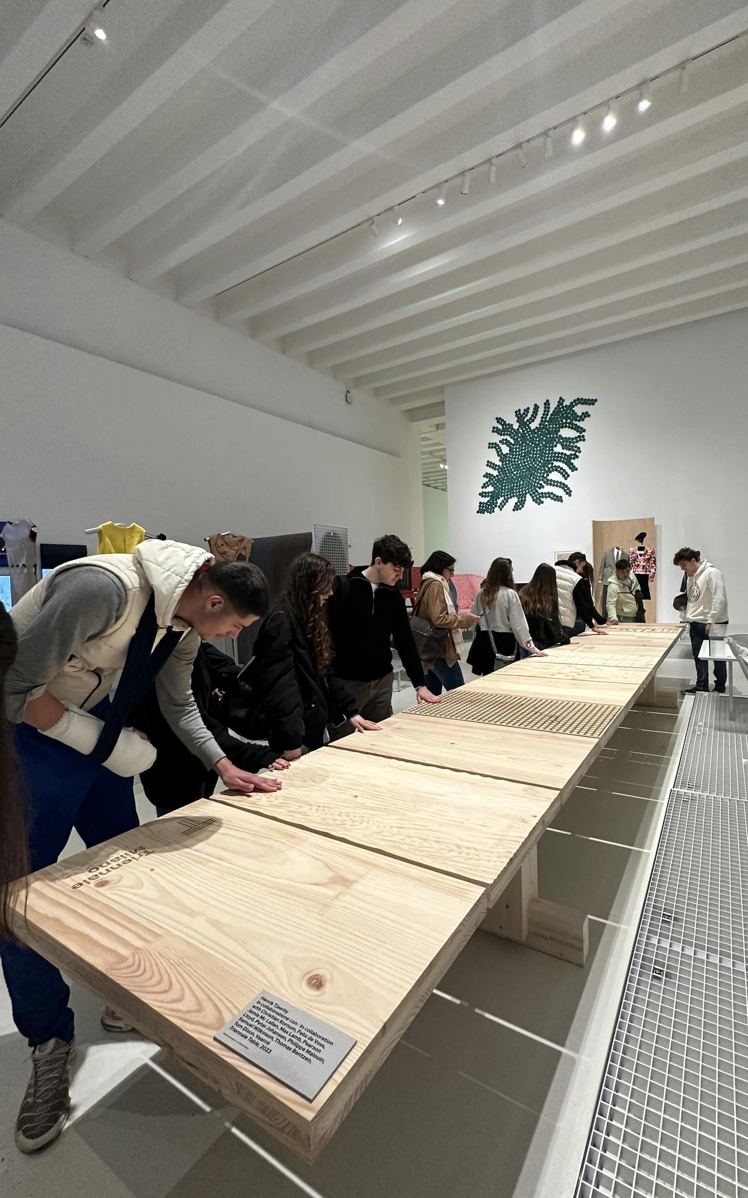
Triennale Table in the exhibition Text, Triennale Milano, 2023, photo by Henrik Tjærby
Who are the people you involved in this project? How did you choose them?
They are designers I met at different times in my life, at the Royal Academy of Arts in Copenhagen or in the studios where I worked, and who are important to me for various reasons. Some of them are very famous, others less so, but each has inspired me and passed something on to me: ideas, a special technique, a specific design process, how to work with new materials, new ways to present to client, and so on. To a certain extent, we are the people we meet along our path, and that’s why I decided to tell my story through them.
Together you have created a kind of catalogue of possibilities, with lots of different textures and finishes that require a whole range of woodworking techniques. Did you give them carte blanche or set a few guidelines?
The only limitations were that their top should be able to hold a glass, carry its own weight and keep the natural color of the wood. Some of these textures and solutions together would be impossible in an industrial production context, so we had fun experimenting by mixing hi- and low-tech. Some of them sent me very detailed drawings and instructions; others, simply an image. Christian Kornum, who is a close friend and one of the most talented makers I know, sent me a picture of sand ripples on the ocean floor and challenged me to reproduce the effect. I knew I had succeeded when my seven-year-old son saw the finished panel and exclaimed: “Look, Dad, the seabed!” Philippe Malouin submitted a video in which he took a very famous stool of his, closed it in a box full of old screws and markers and kicked it down the stairs. I interpreted the resulting finish my children in an activity that was midway between play and performance: we threw some old nuts and bolts on the table panel and started hitting them with a hammer, exploiting the softness of the pine wood. The result is a pattern that could never be replicated: a real one-off.
Nearly all the designers included a touch of humour or a reference to your shared experiences. Could you tell us something about those?
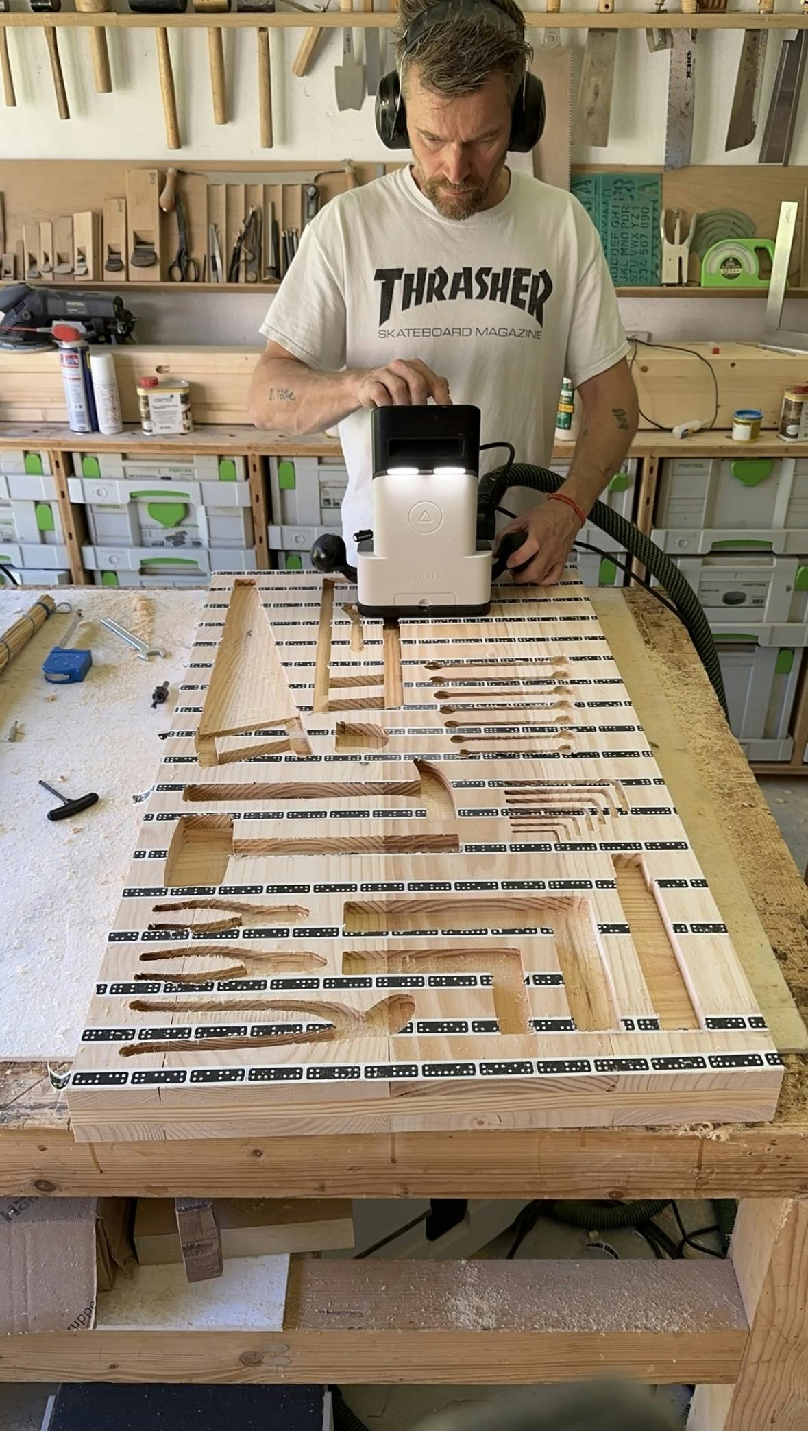
Myself and Tom Dixon, for whom I worked several years ago when he was artistic director of Artek, share a passion for woodworking. We both have a symbiotic relationship with our work tools, so he had the idea of creating a kind of toolbox, which I really like because it doesn’t need any explanations. In fact, it’s obvious which object fits into each of the holders we created; there’s no need to write “screwdriver” or “hammer”. Like Tom and myself, Max Lamb is also mad about tools. He made a panel with a series of holes in a particular relationship with each other. Using the holes to guide a ruler, you can cut material in all kind of angles, also indicated with small engraved numbers in the top. A really functional worktop in the shop!
There is also a secret drawer with an Allen key…
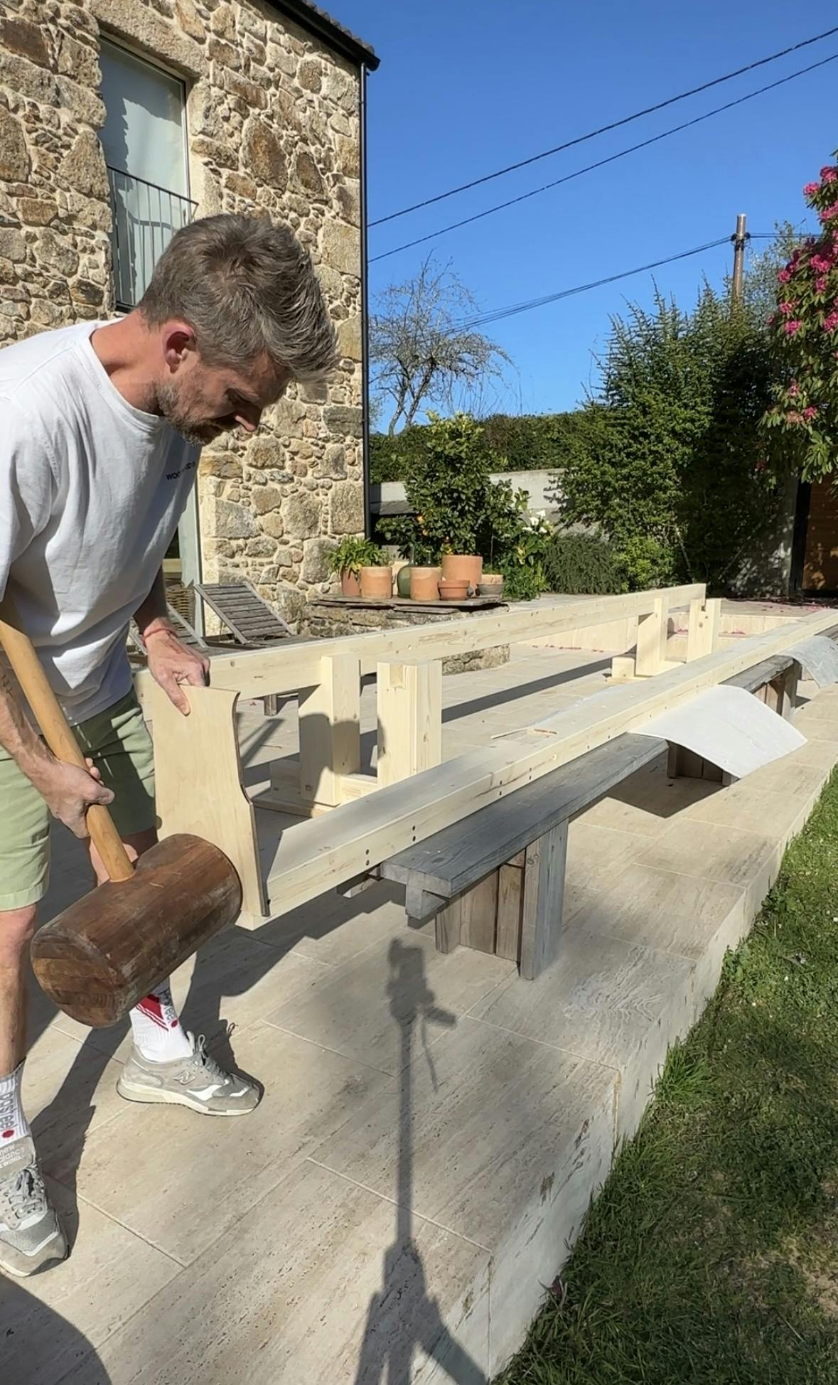
Yes, it’s incorporated in the panel designed by Jamie McLellan. He was creative director at Allbirds, a Californian company that developed the first carbon zero shoe, and has a light-hearted, fun approach to design. I explained to him that I was designing a very long table that had to travel about 2000 km from Spain to Milan, and I wanted it to be easy to assemble, with a single tool: a standard L-shaped Allen key, like the ones at Ikea.
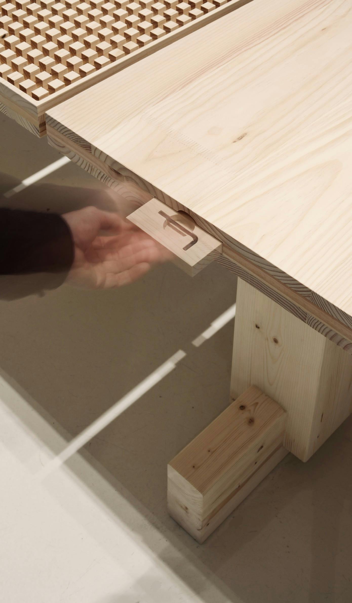
Triennale Table, detail, photo by Henrik Tjærby
Which panel was the most difficult to make?
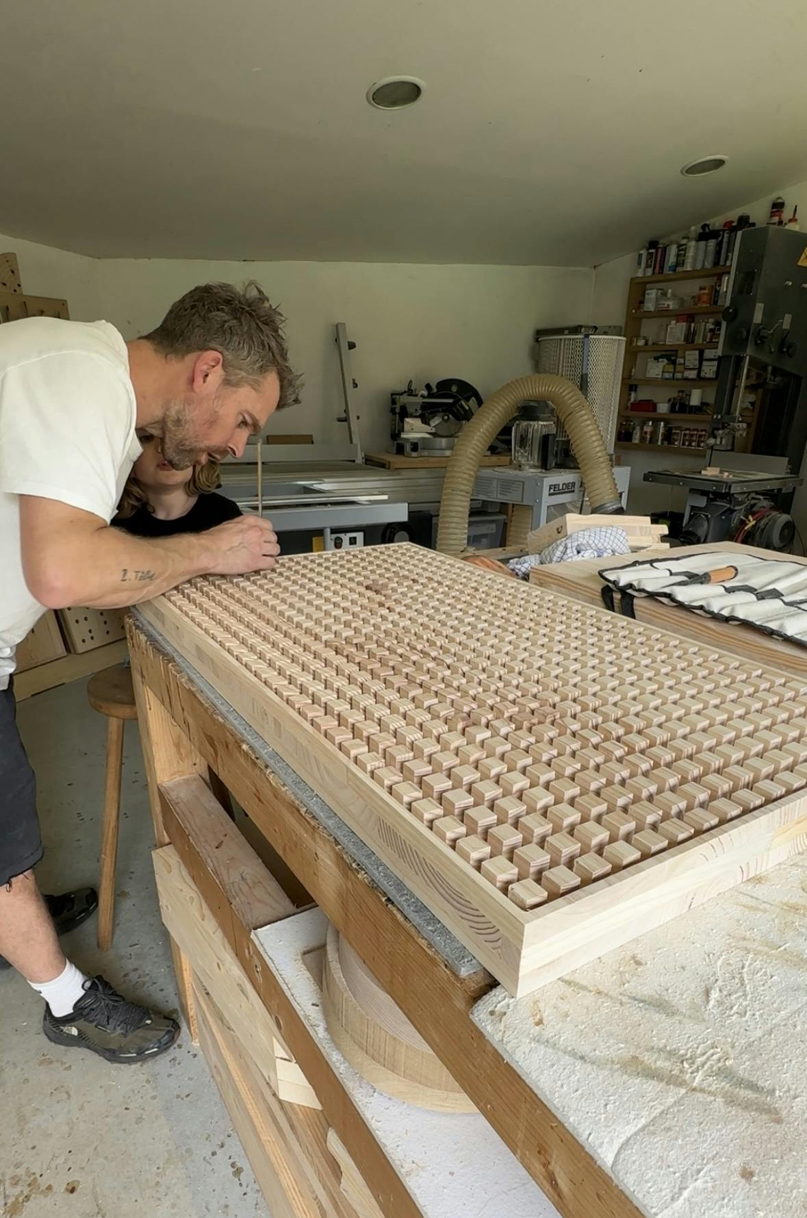
Samuel Wilkinson, whom I met 20 years ago when we worked together at the London studio Pearson Lloyd, proposed a design with 648 cubes, measuring 2 cm on each side, to be made with a CNC milling machine. It was very difficult at the technical level because I had to work slowly, removing tiny portions of material at a time to prevent the cubes from breaking. But I really like the way it turned out; it’s solid but gives the impression of lightness. Felix De Voss’ idea was also difficult to realize: he wanted me to reproduce a serrated pattern similar to the surface of a meat tenderizer, with a kind of gradient effect. The thickness of the motif in the lower part of the panel is just one tenth of a millimeters, so there was no room for error.

Triennale Table, detail, photo by Henrik Tjærby
During your career you have designed a number of large tables and benches, such as the Osa table, which you did for Vaarnii last year. It’s made of pine wood, like the Triennale Table, the maxi version is over three meters long, and Osa is designed for outdoor dining in the summer. Is conviviality important to you?
I like tables and benches mainly for their architectural qualities and because they require fewer ergonomic expedients than, say, a chair: there is no need to think about a headrest or their having to be stackable. The convivial aspect is also important, though. The panels that make up the Trienniale Table top are 55 cm wide, which is the ideal space for each diner. What I love about this particular design is the unconventional proportions. Due to its size, the brutalist leg frame is more similar to what is found in the building industry. Moreover, because of the individual tops and interlocking leg frame, we could in theory go on forever, occupying the entire museum space.
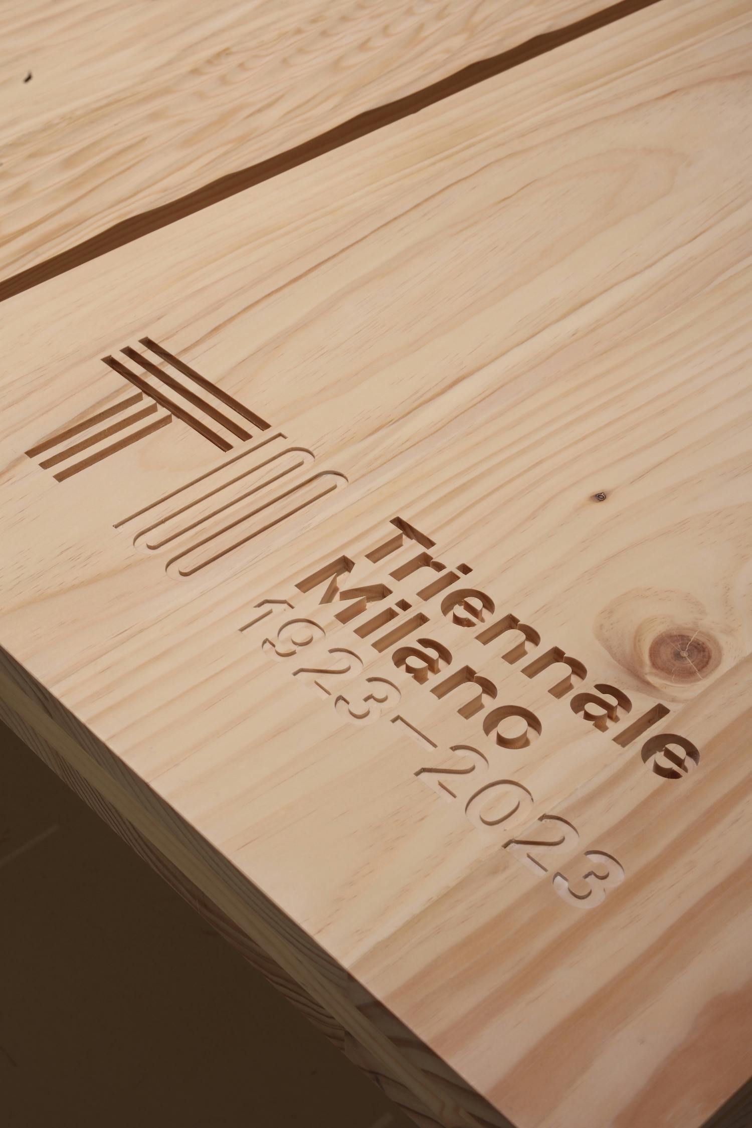
Triennale Table, detail, photo by Henrik Tjærby
Related events
